Introduction
In today’s competitive digital world, a brand’s visual identity can make or break customer perception. One of the most powerful tools to influence how people feel about a brand is color psychology in modern brand design. The colors used in logos, websites, packaging, advertisements, and marketing campaigns play a pivotal role in shaping emotions, decision-making, and brand recall.
Studies show that color increases brand recognition by up to 80% (Colorcom Research). Every color evokes specific feelings: red signals energy and urgency, blue conveys trust and reliability, green represents growth and sustainability, yellow evokes optimism and creativity, and purple indicates luxury and imagination. By strategically applying color psychology in modern brand design, businesses can create an emotional connection with their target audience, differentiate themselves from competitors, and boost customer engagement.
For startups and small businesses, color is a cost-effective yet highly impactful branding tool. Choosing the right colors helps communicate brand values, personality, and promises without words. For example, eco-conscious startups often use green to highlight sustainability, while tech companies leverage blue to establish trust and professionalism.
At Innovizion Studio, we specialize in creating brand identities grounded in color psychology principles. Our branding solutions—from logo design to UI/UX design—ensure that every color choice resonates with the intended audience and supports brand strategy.
This blog explores how color psychology in modern brand design influences consumer behavior, how businesses can leverage it to strengthen their brand identity, and actionable strategies to select colors that leave a lasting impression.
1. Understanding the Basics of Color Psychology
Color psychology is the study of how colors affect human behavior and perception. Brands that understand these principles can craft identities that influence emotions and decision-making.
Primary color meanings in branding:
- Red: Energy, urgency, passion. Often used in fast-food and entertainment brands.
- Blue: Trust, reliability, professionalism. Favored by tech, finance, and healthcare brands.
- Green: Growth, health, sustainability. Common in eco-friendly and wellness businesses.
- Yellow: Optimism, creativity, happiness. Effective for attracting attention and stimulating excitement.
- Purple: Luxury, creativity, wisdom. Suitable for premium or innovative brands.
- Orange: Enthusiasm, affordability, friendliness. Used by startups and casual brands.
By selecting colors aligned with brand values, businesses can subtly influence consumer behavior and perception.
2. How Color Psychology Influences Consumer Behavior
Colors impact decisions subconsciously:
- Warm colors (red, yellow, orange) often stimulate impulse purchases.
- Cool colors (blue, green, purple) foster trust and loyalty.
- Consistent color use across all channels enhances brand recall and recognition.
For instance, a startup adopting blue in its website and marketing materials can build credibility and professional perception, while a creative agency using orange may convey energy and approachability.
External research supports this: According to Forbes, 85% of consumers cite color as a primary reason for why they buy a product.
3. Integrating Color Psychology into Modern Brand Design
Applications of color psychology in branding:
- Logo Design: Colors should reflect the brand’s personality and core values.
- Website & UI Design: Harmonious color schemes improve usability, accessibility, and conversion rates.
- Packaging: Colors influence perceived quality, desirability, and brand recognition.
- Marketing Collateral: Consistent colors across brochures, ads, and social media improve brand recall.
Example: Brands like Innovizion Studio implement color psychology to create cohesive visual identities for clients, ensuring colors align with business goals and target audiences.
4. Cultural and Regional Considerations in Color
Colors have different meanings across cultures:
- In India, red symbolizes prosperity and celebration, while white often represents purity.
- Globally, green may indicate safety, while in some cultures it represents jealousy.
For brands operating across regions, understanding cultural color associations ensures messages resonate positively and avoid misinterpretation.
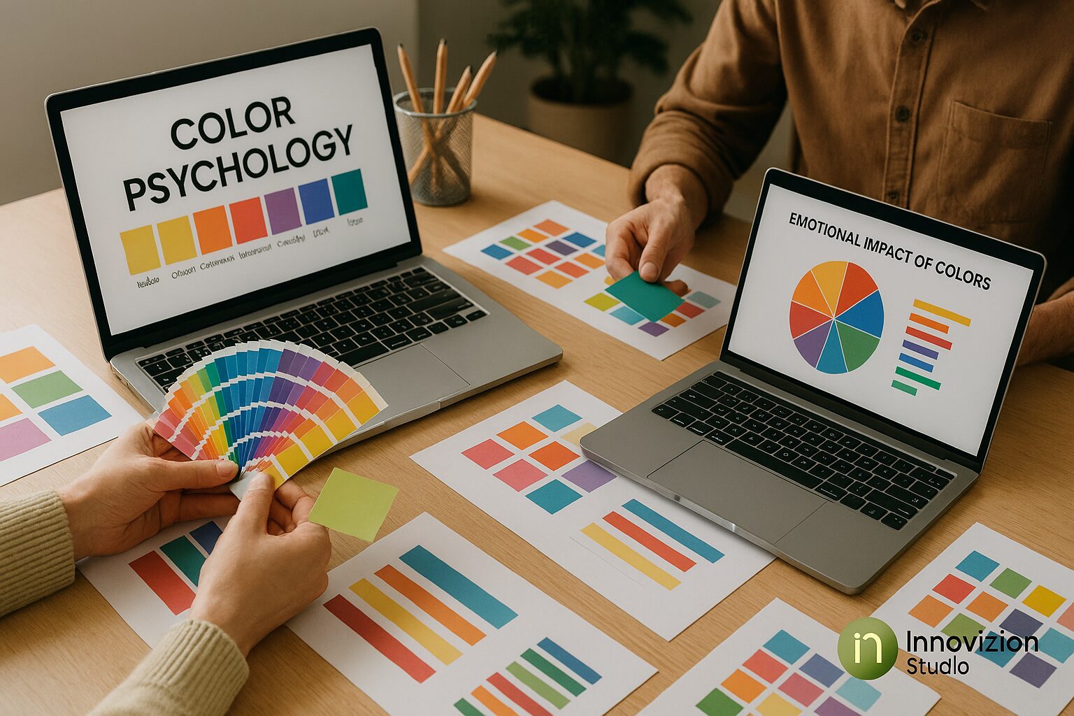
5. Tools and Techniques for Choosing Brand Colors
- Color Theory: Learn about complementary, analogous, triadic, and monochromatic color schemes.
- Digital Tools: Adobe Color, Coolors, Paletton, Canva Color Palette Generator.
- Testing: Preview colors in print and digital mediums to ensure consistency.
- A/B Testing: Measure engagement and conversion rates for different color schemes.
These techniques help brands make data-driven decisions while applying color psychology in modern brand design.
6. Case Studies of Successful Brand Color Use
- Coca-Cola (Red): Evokes excitement, passion, and energy.
- Facebook (Blue): Builds trust, reliability, and professionalism.
- Starbucks (Green): Conveys sustainability, relaxation, and growth.
- Tata (Blue): Establishes credibility and corporate trust in India.
These examples demonstrate the practical impact of color psychology on customer perception and loyalty.
7. Maintaining Brand Color Consistency
- Develop a brand style guide detailing primary and secondary colors.
- Apply colors consistently across all platforms: logo, website, social media, packaging, and advertising.
- Monitor metrics like website engagement, social interaction, and conversions to ensure colors resonate with the audience.
Consistency strengthens brand recognition and builds trust, making color psychology an essential long-term branding strategy.
8. Emerging Trends in Color Psychology for Modern Brands
- Dark Mode Design: Popular in apps and websites, requiring thoughtful color contrast for accessibility.
- Gradient & Vibrant Colors: Used to create modern, dynamic, and visually engaging experiences.
- Minimalist Palettes: Focus on fewer colors to convey clarity and sophistication.
- Adaptive Branding: Colors that change according to user behavior, time of day, or regional preferences.
Brands leveraging these trends can stay ahead and create memorable, engaging visual experiences.
Conclusion
Color psychology in modern brand design is not just about aesthetics—it’s a strategic tool that shapes customer perception, builds trust, and drives engagement. By understanding emotional associations, considering cultural nuances, and applying colors consistently across all touchpoints, brands can enhance their identity and foster customer loyalty.
For businesses looking to strengthen their visual identity, Innovizion Studio offers expert guidance in leveraging color psychology to create cohesive, modern, and impactful brand experiences.