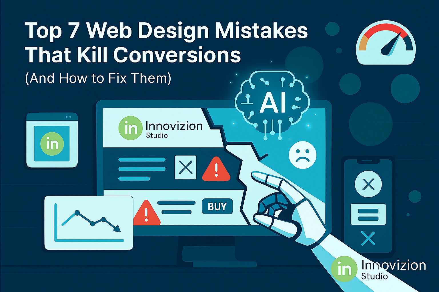
Introduction
Your website is the most important digital asset for any business, but surprisingly, many startups and companies fail to optimize it for conversions. Even a visually appealing website can underperform if it suffers from hidden web design mistakes. In 2025, with attention spans shorter than ever and user expectations higher, avoiding these mistakes is no longer optional—it’s essential for success.
Studies consistently show that web design mistakes can significantly harm user engagement and credibility. A report by Stanford University found that 75% of users judge a company’s credibility based on website design, while Google research indicates visitors form an impression of your site in just 50 milliseconds. These statistics underline the fact that web design mistakes don’t just affect aesthetics—they directly impact conversion rates and your bottom line.
So, what exactly constitutes a web design mistake? These are design flaws, usability issues, or visual inconsistencies that confuse visitors, reduce trust, or make navigation difficult. Examples include cluttered layouts, weak calls-to-action, slow loading pages, inconsistent branding, or poor mobile optimization. Startups often fall into these traps because they focus too much on looks rather than performance, underestimating how crucial conversion-focused design truly is.
Avoiding web design mistakes is not just about following design trends—it’s about understanding your audience, simplifying their journey, and making it effortless for them to take action. Whether you’re trying to generate leads, sell products, or encourage sign-ups, a website with poor design decisions will almost always underperform. Fortunately, each web design mistake has a clear solution, and with the right strategies, you can transform your website into a high-performing, conversion-optimized platform.
This blog will cover the seven most common web design mistakes that silently kill conversions in 2025. Each section will explain why the mistake is harmful, show examples of its impact, and provide actionable fixes you can implement immediately. From cluttered layouts and slow page speed to weak CTAs and missing trust signals, we’ll break down the issues that matter most to startups and growing businesses.
At Innovizion Studio, we’ve seen firsthand how identifying and correcting web design mistakes can dramatically improve engagement and conversions. By combining UI/UX best practices with data-driven insights, startups can design websites that not only look professional but also guide users toward action. From mobile optimization to clear navigation, every detail contributes to a smoother experience and higher conversion rates.
By the end of this blog, you’ll be able to:
- Recognize the critical web design mistakes harming your website.
- Understand the direct impact of these mistakes on user engagement and conversions.
- Apply actionable fixes to optimize layout, speed, CTAs, and trust elements.
- Implement strategies that turn your website into a conversion powerhouse.
Avoiding web design mistakes is about giving your visitors confidence, clarity, and an effortless path to action. With the right adjustments, your website can become more than a digital presence—it can be a high-performing sales tool that consistently attracts, engages, and converts your ideal audience.

1. Cluttered and Confusing Layout
A cluttered website layout overwhelms visitors and makes it difficult to find important information. Too many colors, fonts, or unnecessary elements create visual noise that distracts users from your main message.
Impact on Conversions: Visitors leave quickly when they can’t navigate easily. Bounce rates rise, and conversions drop.
How to Fix It:
- Simplify your layout using a clean grid system.
- Limit fonts to 2–3 and use a consistent color palette.
- Highlight key elements like CTAs and value propositions.
Example: Compare a homepage with ten competing banners vs. one clean hero section with a clear CTA. The latter encourages action.
Pair this advice with UI/UX and Web Design Services to ensure your layout supports conversions.
2. Poor Mobile Optimization
With over 60% of web traffic coming from mobile devices, a non-responsive website is a conversion killer. Buttons too small to click, unreadable text, and broken layouts frustrate users instantly.
How to Fix It:
- Implement a mobile-first design approach.
- Test all pages across multiple devices.
- Ensure buttons are large, clickable, and forms are easy to fill.
Learn more about Web Development Services to enhance mobile performance.
Google’s Mobile-Friendly Test is a great tool to audit your pages.
3. Slow Page Load Speed
Even a one-second delay in page load can reduce conversions by 20%. Heavy images, unoptimized code, and poor hosting can make your site sluggish.
Fix Strategy:
- Compress images and videos.
- Enable browser caching.
- Use a Content Delivery Network (CDN) for global speed.
Check speed with Google PageSpeed Insights.
4. Weak Calls to Action (CTAs)
A website without clear CTAs leaves users confused. Generic buttons like “Click Here” or “Submit” fail to inspire action.
Fix Strategy:
- Use actionable language like “Get Your Free Audit” or “Start Your Trial.”
- Place CTAs above the fold and at relevant points.
- Use contrasting colors to make them stand out.
Example: Compare a bland “Learn More” button vs. “Boost My Conversions Now.”
5. Bad Typography & Readability
Unreadable fonts, tiny text, or poor spacing reduce comprehension and frustrate visitors. Users leave when they struggle to read.
Fix Strategy:
- Stick to web-safe fonts like Roboto, Open Sans, or Lato.
- Maintain line spacing (1.5x recommended) and clear hierarchy.
- Avoid long paragraphs; use headings, lists, and bullets.
6. Inconsistent Branding
Inconsistent colors, messaging, and imagery undermine trust. Users may question your professionalism or credibility.
Fix Strategy:
- Maintain a consistent color palette, font usage, and voice across all pages.
- Use branded elements consistently, including your logo, imagery style, and icons.
Strengthen branding via Branding and Design Services.
7. Ignoring Trust Signals
Users hesitate to convert when trust signals are missing. Absence of SSL, testimonials, reviews, or guarantees leads to uncertainty.
Fix Strategy:
- Install SSL certificates and display trust badges.
- Showcase reviews, case studies, and client logos.
- Include clear refund or satisfaction guarantees.
Our Social Media and Content Services can help showcase testimonials and social proof effectively.
Learn more about trust signals with HubSpot CRO Guide.
Conclusion
Web design is more than aesthetics—it’s a conversion engine. Avoiding these seven mistakes can dramatically improve user experience, build trust, and boost conversions. From cluttered layouts and slow pages to weak CTAs and ignored trust signals, each fix is an opportunity to turn visitors into loyal customers.
If your website needs a conversion-focused redesign, get in touch with Innovizion Studio and let our experts help you optimize every element for higher engagement and sales.