
Introduction
In today’s digital-first era, businesses must ensure their websites provide a seamless experience across all devices. With more than half of global web traffic coming from smartphones and tablets, having a site that adapts fluidly to different screen sizes is no longer optional—it’s a necessity. Responsive design addresses this challenge by enabling websites to automatically adjust layouts, images, and interactive elements, creating a consistent user experience whether viewed on a desktop, tablet, or mobile device.
For modern businesses, responsive design is about more than just technical optimization. It directly impacts user engagement, search engine rankings, and conversion rates. A website that fails to render properly on mobile devices risks frustrating visitors, increasing bounce rates, and losing potential customers to competitors. According to Google’s mobile-first indexing guidelines, websites that are not optimized for mobile can suffer in search visibility, underscoring the SEO advantage of adopting responsive strategies.
Startups and growing businesses in India face unique challenges. They often operate in highly competitive industries such as e-commerce, fintech, and SaaS, where first impressions are crucial. A well-implemented responsive website can differentiate a brand, establish credibility, and build trust with prospective clients. By ensuring that navigation is intuitive, content is readable, and visuals are optimized for every device, businesses can deliver a polished, professional experience that keeps users engaged.
Moreover, mobile-friendly website design contributes to long-term growth by enhancing user satisfaction and increasing the likelihood of conversions. Visitors are more likely to complete actions such as signing up for a newsletter, requesting a demo, or making a purchase when the website experience is smooth and visually consistent. This makes responsive design not just a technical feature, but a strategic tool for driving business results.
Implementing responsive design requires careful planning. From using flexible grids and scalable images to leveraging CSS media queries and breakpoints, businesses can create a site that looks great on any device. Tools like Bootstrap or CSS Flexbox and Grid frameworks simplify the process, enabling designers and developers to build adaptive layouts efficiently. Additionally, monitoring analytics and testing across devices ensures that the site performs optimally, providing a high-quality experience for all users.
At Innovizion Studio, we’ve helped numerous businesses transform their websites with responsive design strategies. From startups launching new platforms to established companies modernizing legacy websites, adopting responsive principles has consistently led to higher engagement, better SEO performance, and increased conversions. By prioritizing UI/UX responsive design and cross-device optimization, businesses can future-proof their websites while delivering exceptional experiences to every visitor.
By the end of this guide, you’ll understand the core principles of responsive design, its impact on business success, and actionable steps to implement a responsive website that engages users, boosts SEO, and drives conversions. Whether you are a startup aiming to capture market share or an established business seeking to optimize user experience, responsive design is the cornerstone of modern, effective web presence.
What is Responsive Design?
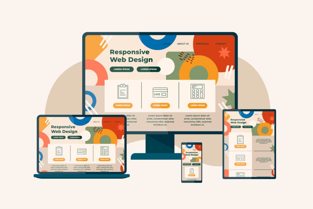
Responsive design is a web design approach that ensures websites automatically adapt to the screen size, orientation, and platform of the user. This design philosophy uses flexible grids, layouts, images, and CSS media queries to create websites that look and function well on any device.
Difference Between Responsive and Adaptive Design:
- Responsive Design: Flexible layout adjusts dynamically to any screen size
- Adaptive Design: Predefined layouts for specific devices, may not scale as fluidly
Key Principle: The user should experience the same brand message, visual hierarchy, and functionality regardless of the device used.
Why Modern Businesses Need Responsive Design
- Mobile-First Trend: With mobile traffic surpassing desktop traffic globally, websites must be optimized for small screens first.
- Improved User Experience: Responsive design ensures smooth navigation, readable content, and visually consistent layouts.
- SEO Advantages: Google prioritizes mobile-friendly websites for search rankings.
- Increased Conversions: Easy-to-navigate sites encourage purchases, sign-ups, and engagement.
- Competitive Edge: Businesses with responsive websites stand out in crowded markets.
Core Elements of Responsive Design
- Flexible Grids & Layouts: Layouts should scale fluidly based on screen width.
- Media Queries & Breakpoints: CSS queries allow design adjustments at specific screen widths.
- Scalable Images & Media: Images and videos should resize without loss of quality.
- Consistent Navigation & UI Elements: Menus, buttons, and CTAs should be usable on all devices.
Internal Links:
How to Implement Responsive Design
- Plan Mobile-First: Start design thinking with smaller screens, then scale up.
- Use Modern Frameworks: Bootstrap, CSS Grid, Flexbox help create flexible layouts.
- Optimize Images & Media: Use scalable formats like SVG, compress images to reduce load time.
- Test Across Devices: Check for layout consistency, readability, and functionality.
- Monitor & Iterate: Use analytics to track engagement and identify UX issues.
External Links:
Common Mistakes in Responsive Design
- Overcomplicated layouts that don’t scale well
- Large images slowing down page load
- Inconsistent design elements across devices
- Ignoring mobile interactions like touch gestures
Fix: Keep layouts simple, optimize media, and maintain consistent visual hierarchy.
Benefits of Responsive Design for Businesses
- Better User Experience: Easy navigation and readability
- Higher Conversion Rates: Smooth experience leads to more actions
- SEO Advantages: Mobile-friendly websites rank higher
- Cost-Efficient: One site for all devices reduces maintenance overhead
- Brand Credibility: Consistent experience builds trust
Conclusion
For modern businesses, responsive design is no longer optional. It’s essential for delivering superior user experiences, improving search rankings, and maximizing conversions. By embracing mobile-first principles, flexible layouts, and adaptive visuals, businesses can thrive in a competitive digital landscape.
If you’re ready to optimize your website for responsive design, contact Innovizion Studio to create a seamless, cross-device digital experience that drives engagement and growth.