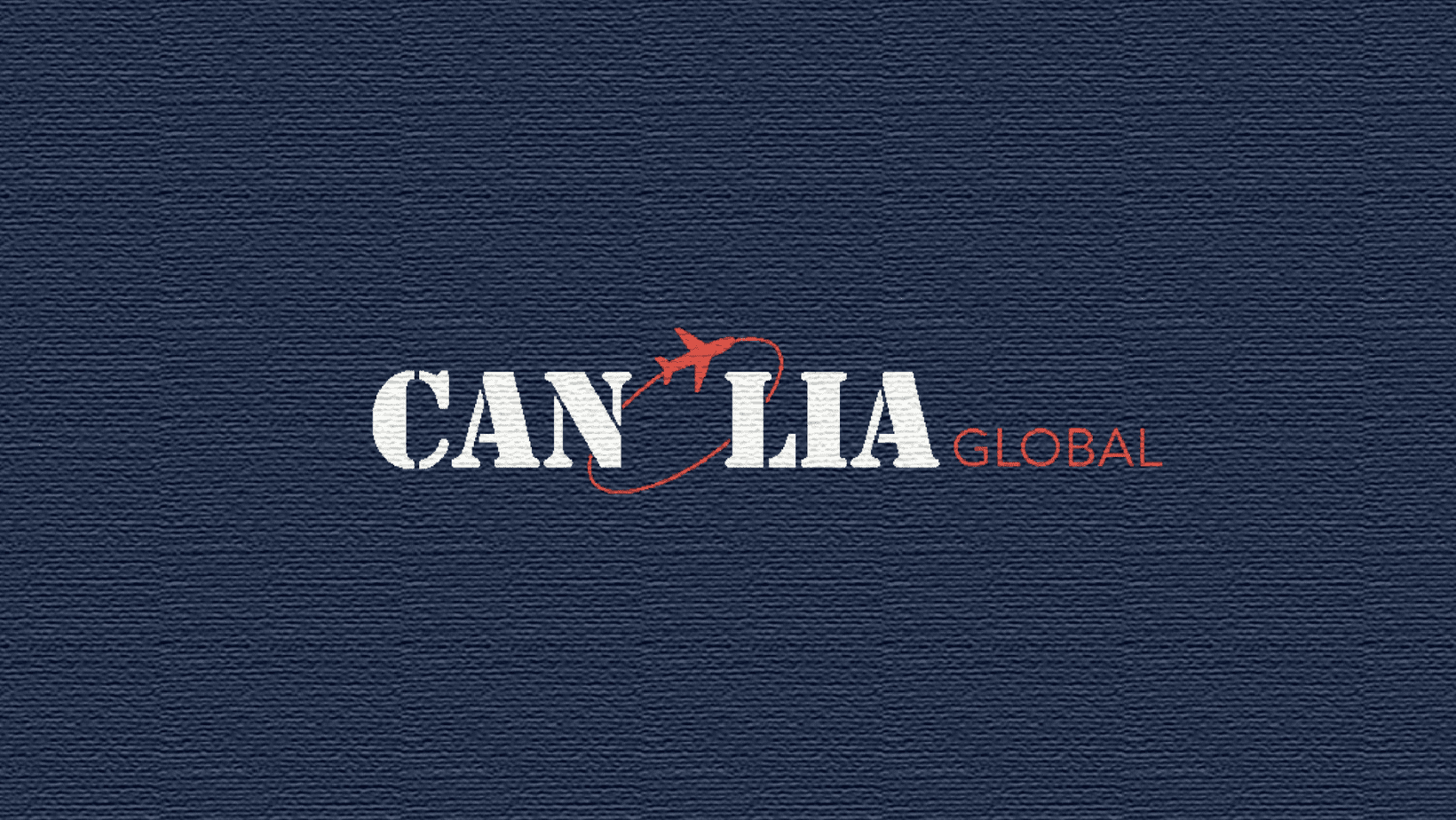
Canlia Global’s previous brand presence lacked memorability and did not communicate its purpose effectively. The absence of a professional logo and cohesive branding reduced credibility — especially important in an industry where trust is paramount. Their visual identity appeared generic, with no strong recall or unique elements to differentiate them in the visa and overseas travel space.
We started by conducting a brand audit and competitor benchmarking. Through collaborative strategy workshops, we identified Canlia’s unique value propositions and emotional impact goals. Based on this, we conceptualized several logo directions — exploring ideas like passports, compasses, pathways, and abstract global motifs.
After multiple iterations and feedback loops, we finalized a versatile logo system that included the primary logo, logomark, icon variations, and responsive formats. We paired this with a brand color palette that signaled professionalism, trust, and optimism. Our design language focused on clean lines, open space, and easy readability to align with digital and print usage.
To support brand rollout, we developed templates for business cards, social media creatives, brochures, and travel kits — ensuring visual consistency across all customer touchpoints.
The final brand identity positioned Canlia Global as a modern, trusted partner in the global travel and migration industry. The logo blended global symbolism with minimalist design, adaptable across digital, signage, and marketing platforms. The brand voice and visual elements now clearly communicate Canlia’s promise of clarity, guidance, and world-class service.
Since rebranding, Canlia has seen increased engagement across social channels, stronger client trust, and better recall at education fairs and expos. Their updated identity now empowers them to compete confidently in both Indian and international markets.