Krease, despite having a bold product vision, lacked a brand identity that truly captured the energy of their clothing line. Their earlier visuals were either too masculine or too minimalist to communicate the balance of unisex fashion and expressive streetwear culture.
Additionally, the brand needed a design system that would look equally strong across diverse applications — from woven labels and swing tags to social avatars and shipping boxes. The absence of a cohesive visual identity limited Krease’s ability to connect with its young, expressive, gender-fluid audience.
We started by diving into the fashion culture landscape — from Gen Z streetwear communities to global minimalist labels — and identified visual patterns that appeal across gender and style boundaries.
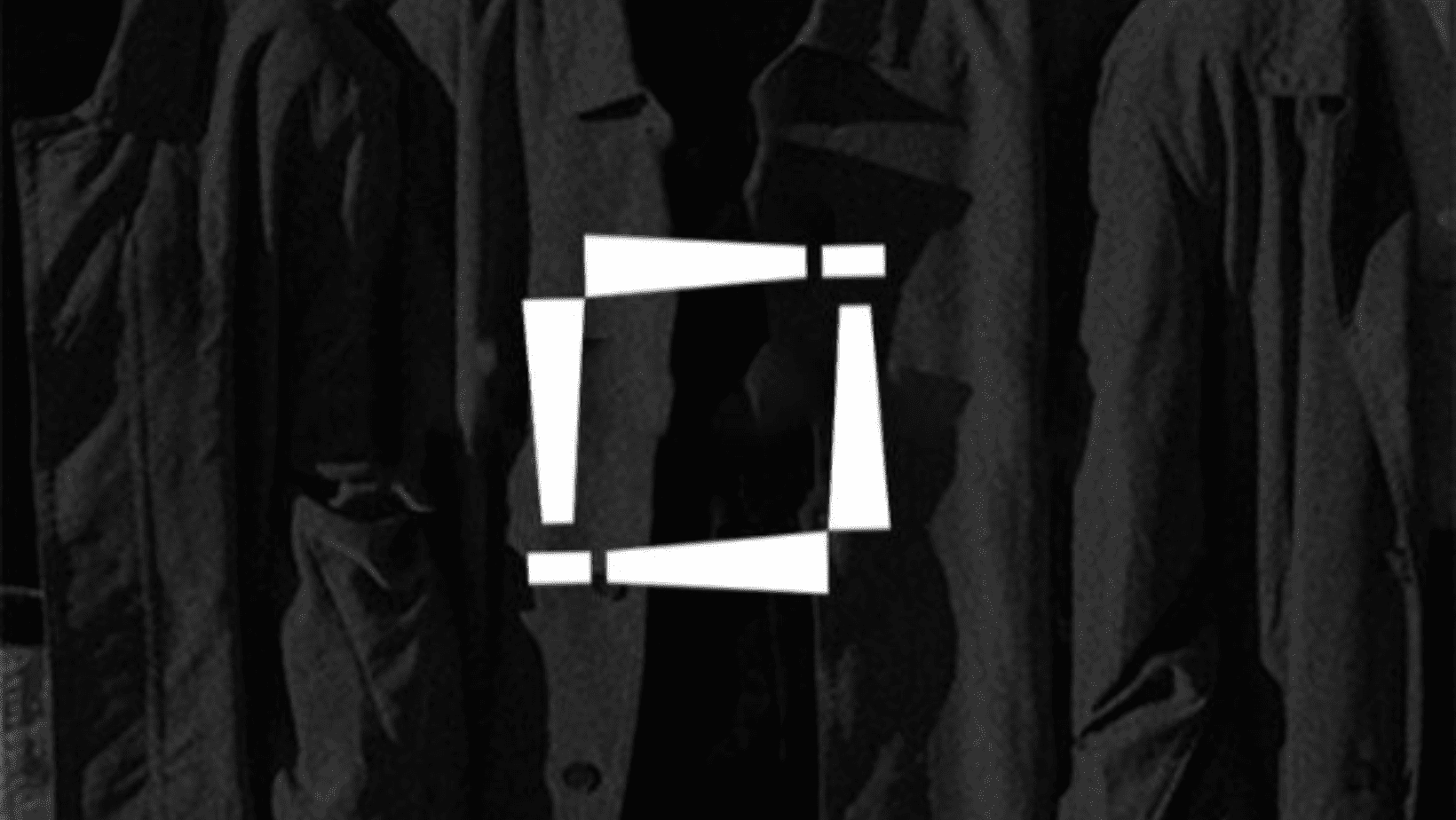
The logo design was rooted in boldness and simplicity. We explored custom typography options that felt modern and balanced, with letters spaced precisely to give it a confident stance. Clean cuts and geometric finishes brought in a utilitarian edge, while the overall logo form remained approachable and inclusive.
We avoided overly ornate elements and instead focused on a mark that could live naturally across T-shirts, hoodies, packaging, and digital media. A supporting icon set and monogram version of the logo were also created for embroidery, garment tags, and compact branding applications.
The final Krease logo is a fusion of form and functionality — modern, gender-neutral, and unmistakably fashion-forward. Its simplicity ensures legibility across all formats, from Instagram icons to stitched logos on caps or sleeves.
The brand now carries a versatile visual identity that’s instantly recognizable, scalable across SKUs, and aligned with the evolving culture of unisex fashion. The logo not only empowers Krease to showcase its products confidently but also builds trust with an audience that values both style and inclusivity.
Following the rebranding, Krease reported increased engagement on social platforms and better reception from fashion stockists looking for fresh, inclusive streetwear labels.