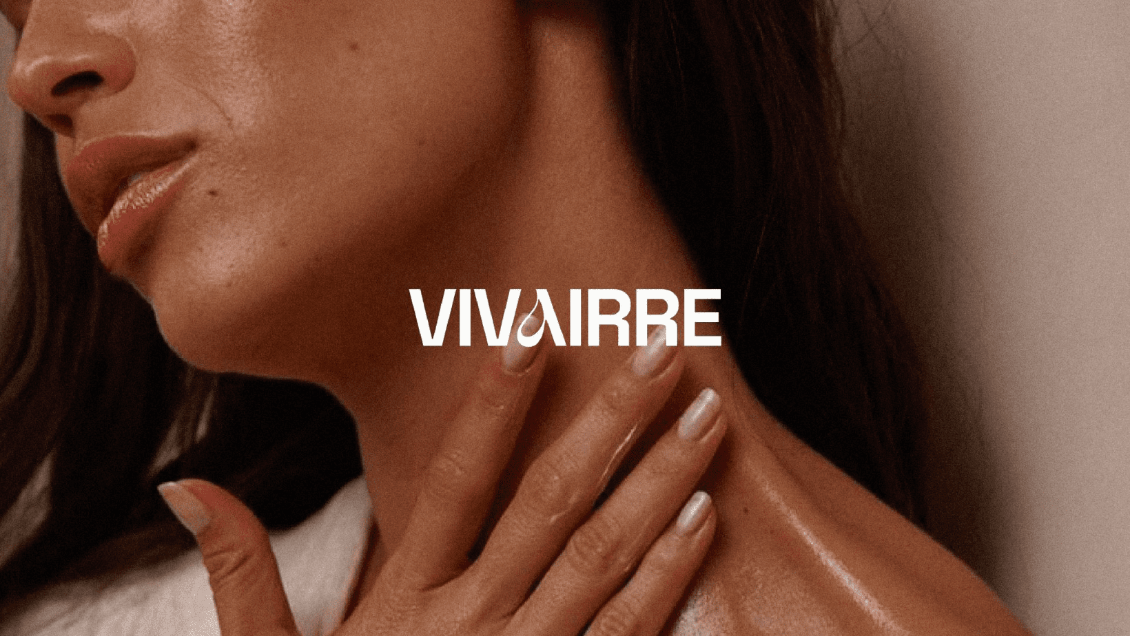
Vivairee struggled with an undefined brand identity and inconsistent packaging that didn’t reflect the product quality or appeal to its core audience — women who value self-care, elegance, and ethical beauty.
The original product containers lacked shelf distinction and failed to evoke a sense of luxury or trust — key factors in beauty consumer decisions. Additionally, the brand didn’t have strong visual recall, making it difficult to differentiate in online stores or on retail shelves crowded with similar-looking competitors.
We began by researching the emotional motivators behind modern beauty buyers — confidence, purity, and self-indulgence. We studied top competitors and emerging direct-to-consumer beauty brands to identify whitespace for differentiation.
The brand identity was developed around the themes of femininity, serenity, and modern sophistication. We designed a custom logotype with soft curves and subtle symmetry, representing balance and care.
Packaging was approached modularly: soft-touch matte finishes, elegant serif typography, and pastel tones (like blush, cream, and lavender) were paired with metallic foiling and embossed accents to convey premium quality. Sustainable material choices aligned with the brand’s clean beauty ethos.
Typography, iconography, and color palette were chosen to appeal visually while being readable across label sizes and digital platforms. The system was designed to scale effortlessly across future products, including gift boxes and seasonal collections.
We delivered a comprehensive brand identity, packaging architecture for 12 SKUs, and social media visual assets to ensure cohesive brand storytelling.
Each Vivairee product now carries a distinct emotional value — from the first look at the packaging to the moment of unboxing. Soft hues and elegant layout structures reflect calmness and trust, while strategic layout hierarchies ensure easy readability on shelves and e-commerce thumbnails.
The new packaging is also influencer-friendly, photographed beautifully under both studio and natural light, and aligns with unboxing trends on platforms like Instagram and YouTube.
Since launching the new brand identity and packaging system, Vivairee has seen improved engagement from its target audience, better retail placement opportunities, and stronger digital recall — transforming it from an overlooked label into a cherished daily ritual for its users.